
How to Make Your Website Easy to Navigate
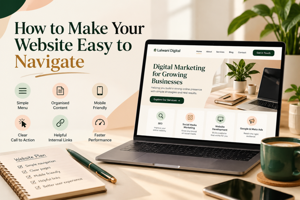
Make your website easy to navigate, and you make it simpler for people to understand your business. A visitor should not have to spend several minutes searching for your services, reading through unrelated information, or figuring out which button to click. The journey from opening your website to finding something useful should feel clear and comfortable.
Consider a small business owner looking for a website designer. They visit three different websites. One has a confusing menu, another hides its contact details, and the third clearly explains its services and provides an easy way to get in touch. Which website do you think they will feel more comfortable exploring?
The answer is quite simple.
People appreciate websites that respect their time. A clear layout helps visitors focus on the information they came for instead of struggling with the design.
Whether you are creating a new website or improving an existing one, a few thoughtful decisions can make a noticeable difference.
1. Think About What Visitors Want to Find First
Before deciding how your website should look, think about the people who will use it.
Someone visiting a restaurant website may want to check the menu or opening hours. A person visiting a digital marketing agency may be interested in its services, previous work, or contact details.
These visitors have different needs, so your website should reflect what matters most to your audience.
Start by listing the five or six things people are most likely to look for. Use that list to plan your main menu and homepage sections.
This small exercise can prevent unnecessary pages and help you create a layout that serves a real purpose.
2. Give Your Menu a Clear Structure
A website menu should work like a helpful guide. It should show visitors where they can go without making them stop and think about the meaning of each option.
For a business website, sections such as Home, About, Services, Portfolio, Blog, and Contact are usually easy to understand.
If you offer several services, you do not need to display every service separately in the main header. You can place them under one Services option and organise them on a dedicated page.
Also, avoid changing menu labels simply to make them sound creative. A familiar word is often more useful than an unusual one when visitors are trying to find information.
Keep the menu consistent across your pages so people always know where to look.
3. Make Your Homepage a Useful Starting Point
Your homepage is not meant to contain every detail about your business. Its job is to introduce your brand and help visitors choose what they want to explore next.
Begin with a clear heading that explains what your business does. Follow it with a short introduction and links to your main sections.
For example, a digital marketing agency can introduce its services on the homepage and provide separate links for visitors who want to learn more about SEO, social media, or website development.
Avoid filling the homepage with long paragraphs that push important information too far down the page.
A well-planned homepage gives visitors a quick understanding of your business and makes their next step easier.
4. Keep Each Page Focused on One Main Topic
Have you ever opened a webpage and found yourself reading about several unrelated things? It can be difficult to follow the message when too much information is placed together.
Each page on your website should have a clear subject.
Your About page can explain your background and approach. A service page can describe what you offer and how it may help customers. A blog post can explore one topic in detail.
When information is grouped logically, visitors can find relevant answers without reading the entire website.
This also makes future updates easier because you know exactly where each piece of information belongs.
5. Make the Mobile Experience Comfortable
A website that looks perfect on a computer may feel completely different on a phone. Text can become too small, images may take up too much space, and buttons can be difficult to tap.
That is why mobile testing should be part of the design process, not something left until the end.
Open your website on a smartphone and check whether the menu is easy to use. Read a few paragraphs, tap the buttons, and move between pages.
Pay attention to small details. Is there enough space between links? Can visitors read the headings without zooming in? Does the page fit the screen properly?
These checks can reveal problems that are easy to overlook when designing on a desktop.
6. Use Headings That Tell Readers What Comes Next
Visitors often scan a page before deciding which sections deserve their attention. Clear headings help them understand the content without reading every sentence.
For example, a heading such as “What Is Included in Our Website Design Service?” gives readers a better idea of the section than a general heading like “More Details.”
You can also use bullet points to present information that would otherwise become a long paragraph.
Try to keep your writing direct and avoid repeating the same idea in different sections.
When visitors can quickly understand what a page contains, they can move through it with greater confidence.
7. Place Buttons Where They Are Actually Useful
Buttons should help visitors take the next logical step. They should not be added simply because a page looks empty.
Think about what someone might want to do after reading a particular section.
After learning about your services, they may want to contact you. After reading a blog, they may be interested in a related article.
Use buttons such as “Explore Our Services,” “Read the Full Guide,” or “Contact Us” to make these options clear. Just like I used on my website pages at LalwaniDigital.
Keep the wording short and make sure each button leads to the correct page. A button that does not work can create confusion and reduce trust in your website.
8. Connect Your Pages in a Meaningful Way
Your website should feel like a collection of related information rather than a group of separate pages.
Internal links help create these connections.
For example, a blog discussing website design can direct readers to your website development service page. A service page can also link to an article that explains a related concept in greater detail.
These links give visitors useful ways to continue exploring without having to search for the next page themselves.
Choose links carefully. They should add value to the reading experience rather than interrupt it.
9. Do Not Let Slow Pages Interrupt the Experience
Even a well-organised website can become frustrating when pages take too long to open.
Large images, unnecessary plugins, and poorly optimised elements can affect how quickly a page loads.
Review your website from time to time. Remove tools you no longer need, upload appropriately sized images, and check whether all sections are working correctly.
A smooth browsing experience depends on more than appearance. Visitors should be able to move between pages without unnecessary delays.
10. Ask Someone Else to Explore Your Website
You already know where everything is on your website. A first-time visitor does not.
This difference can make it difficult to recognise navigation problems on your own.
Ask a friend, colleague, or potential customer to complete a few simple tasks. For example, ask them to find your services, locate your contact details, or open a particular blog post.
Watch where they hesitate or click the wrong option. Their experience can show you which parts of the website need attention.
You do not need to make every suggested change, but genuine feedback can help you see your design from a new perspective.
Conclusion
A website becomes easier to use when its design follows the needs of the people visiting it. Clear menus, focused pages, helpful links, and a comfortable mobile layout all contribute to a better experience.
You do not have to redesign everything at once. Start with the areas where visitors may be getting confused and make improvements one step at a time.
At Lalwani Digital, we believe that a website should do more than present information. It should help people understand a business, explore its offerings, and find the answers they need without unnecessary effort.
When visitors can move through your website naturally, they can spend less time figuring out the layout and more time discovering what your business has to offer. For additional guidance, you can explore Google’s recommendations for mobile-friendly websites and learn how to make your website more accessible to mobile users.